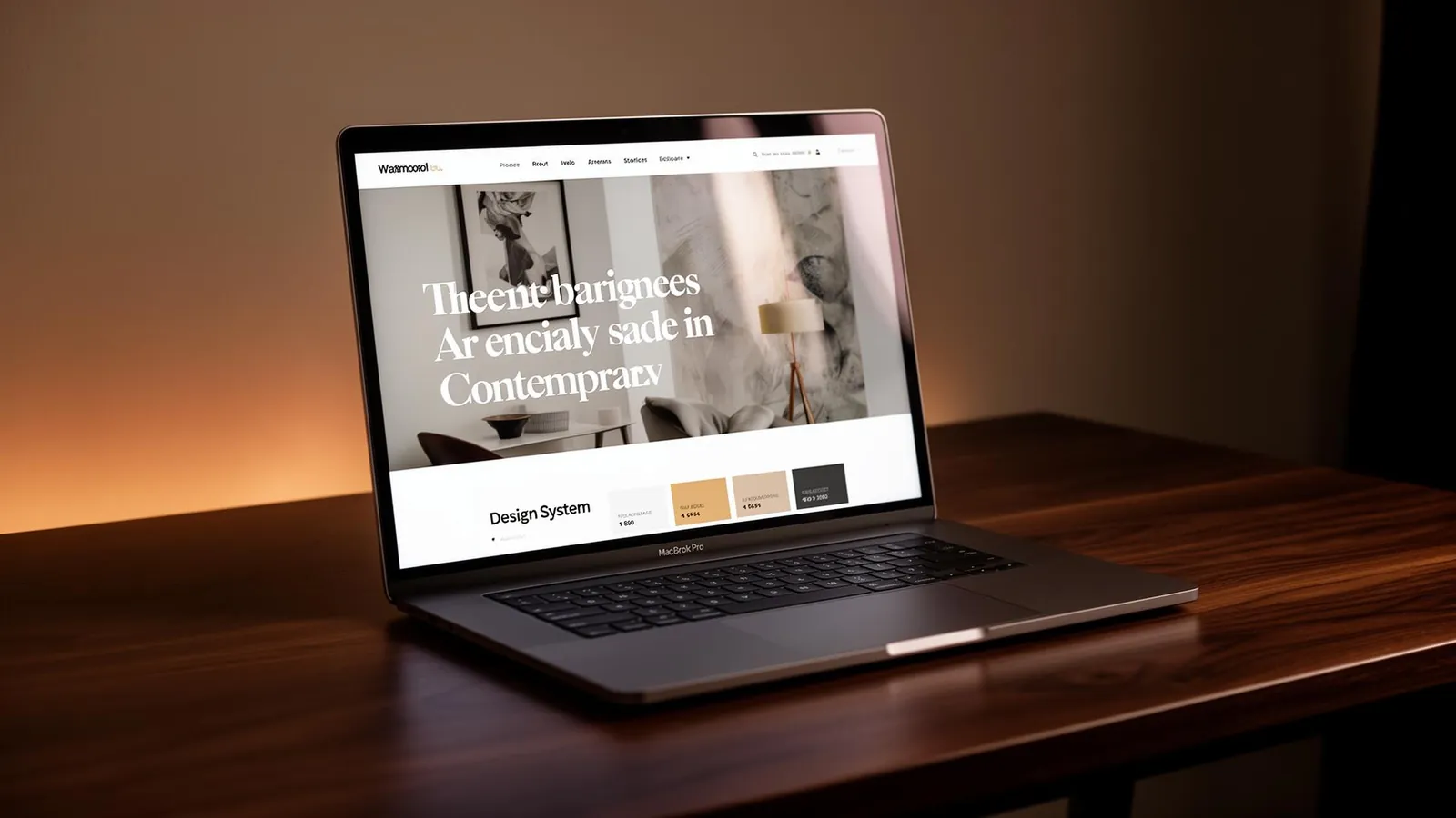
Two or three years ago, building a website started in a Figma file, continued with hand-coding every component, and ended after weeks of QA. Today, in 2026, most of that process collapses into a single conversation with a language model. It's not just a technological shift - it's a full cultural shift in how we think about designing and building for the web.
1. Vibe Coding - describe the feeling, get a product
The term vibe coding went mainstream after Andrej Karpathy coined it in early 2025, and quickly became the dominant way designers and founders ship websites. Instead of technically specifying what every button does, you describe a vibe to the AI: "I want a site that feels like a gallery in Oslo in winter - minimal, cold, lots of air and a delicate serif". The AI translates that feeling into working code.
That means the designer's job has changed: less "pushing pixels" and more articulating a vision, exercising taste, and editing what the AI proposes. The most in-demand skill today isn't Figma - it's the ability to describe, in precise words, how something should feel.
2. AI-First Design Systems
Design systems are no longer built only for human designers. They are built so a language model can consume them - with explicit semantic tokens, natural-language documentation, and usage examples for every component. When the system is right, you can ask the AI to "build me a new landing for product X" and it stays loyal to the brand without you having to mention it.
3. Living sites - content that adapts to the visitor
With model APIs cheap enough to run on every page load, many sites are no longer static. The headline, the image and the CTA copy change based on where the visitor came from, the time of day, or even the weather at their location. This isn't A/B testing - it's real-time personalization.
4. Motion by default
In 2026, a site without motion feels flat. But not flashy animations - rather micro-interactions: subtle hovers, smooth section transitions, hinted scroll-linked parallax. Libraries like Motion and GSAP have become a baseline part of the stack, and AI models know to add them automatically to the components they generate.
5. Huge type, asymmetry and "broken grid"
The standout visual trend of the year is a return to oversized typography (especially modern serif variants), paired with asymmetric layouts that feel handmade. After a decade of perfect grids, the industry is hungry for sites that feel like someone actually built them, not exported them from a machine.
6. Performance = SEO = revenue
Core Web Vitals are no longer just "nice to have". With Google Search now translating results through AI Overviews, slow sites simply don't show up. Edge rendering, image optimization and smart lazy loading are table stakes, not bonuses.
How to combine all of this without getting lost?
The most common mistake I see is chasing every trend. A great site in 2026 is one that knows how to choose: a clear vibe, a design system that speaks to it, motion that serves rather than distracts, and content that works. AI is a wonderful tool - but the big decisions (which vibe, which audience, what's the story) are still yours.
Choose a trend for the business, not the feed
Before adding motion or enlarging a headline, ask what the visitor needs to understand. A keyboard store such as GaliKey invites attention to product photography and categories. For a restaurant site such as UMAMI, an image can establish atmosphere, but it cannot replace clear menu information and contact details. Different tasks deserve different design decisions rather than the same fashionable layout with another logo.
Write down three actions a visitor should complete: recognize the business, find relevant information and know how to get in touch. Test every visual trend against those actions. Does it help, interrupt or simply look attractive in a screenshot? A huge heading that pushes important information out of reach on a phone needs another pass. An image transition that makes reading difficult is a reason to simplify, not a reason to add another effect.
Build a visual language that can continue
A professional's site such as Dr. Galit Levi's raises questions about readable descriptions, portrait photography and trust. A.K. Projects suggests a different exercise: deciding how project images and explanations share attention. These are design examples, not claims about client performance. Ask what leads the page, what follows and how the action fits the story.
Document the answers for the AI: short headings, inspectable images and a clear primary action in each area. Try the rules on an ordinary contact page as well as the impressive opening screen. If that everyday page still feels coherent, the direction is easier to maintain. A trend becomes useful when it supports the whole website rather than one polished image.
Keep control of personalization and motion
Changing content for each visitor is not a requirement for every business. First establish accurate information, shareable pages and a clear explanation of any data collection. Only add personalization when there is a defined need. Motion deserves the same restraint: check reduced-motion settings, navigation and whether text stays visible when effects stop. A visitor should never have to wait for an animation to use the site.
Finally, open the result on a phone and navigate with a keyboard. Read the headings without the images. Review the portfolio for one useful decision rather than an entire design to copy. The strongest trend is the one you can explain in terms of the visitor's needs.
Related articles
- Vibe Coding - A Practical Guide to Building With AI
How to write prompts that produce a site that feels exactly like you imagined, where AI shines, and where a human hand is still needed.
- 7 Web Design Principles That Work on Every Project
Visual hierarchy, whitespace, typography and color - the classic principles that make a site feel professional, even as trends shift.